The Role of Color in Login Page Design: How to Choose the Right Palette
The significant technological boom shows its impact on the business world and influences it to make websites virtual storefronts. So every website has a login page as a gateway to products and services. Therefore, login page design is crucial to providing a positive user experience, increasing engagement, and driving conversions. Also, login page design ideas matter, as Steve Jobs said:
“Design is not just what it looks like and feels like. Design is how it works.”
Do you know that color is essential for login page design?
Color has the power to improve your brand recognition by 80%.
Color psychologically impacts users’ perceptions and can evoke emotions, influence behavior, and reinforce brand identity.
Now you know how much color selection means to make your login page design ideas unique and different from other brands. To make your color selection journey easy and fruitful, we have prepared a guide for you that will assist you in knowing the role of color in login page design effectively and how you can choose the right color palette. Let’s take a deep dive!
What is color theory?
The principles and guidelines that dominate the selection, combination, and use of colors to introduce compelling and aesthetically appealing web design are known as color theory. Understanding the science of color is vital, as emotions and psychology combined with the impact of color on user behavior and experience matter the most.
If we weigh this concept in the matter of web design, then yes, it is 100% accurate because the color is the first thing that attracts the customer most, but if your color selection is not what goes parallel with your brand idea, then you might not only lose your potential customers, but the chances are high that you can face a high sales decline.
The impact of color on initial perception ranges from 62% to 90%.
Two aspects involve color theory; the first is the color wheel, a visual representation of the spectrum of color. The web designers used this wheel to make a color scheme, a harmonious combination of colors that create a specific mood or cause a particular emotion.
The other aspect is color contrast, which refers to the difference in brightness, saturation, or tone between different colors. Contrast can attract visual interest, emphasize significant elements, and enhance readability.
Role of Color in Login Page Design
When you combine your thoughts to bring out unique login page design ideas, color is the most significant factor to consider. It is critical in impacting your brand image in people’s minds, enhancing user experience, and creating emotional engagement.
Color is the top visual priority for nearly 40% of consumers visiting a business website.
Implying the color that resonates with your brand message can create a sense of association in users. The factors reveal the importance of login page design color. The colors used on the login page design should be consistent with the overall website or app design aesthetic and guidelines. This consistency reinforces the brand’s persona and narrative.
The other factor is the emotional impact of color, as we know that different colors can induce diverse emotions and perceptions in users. So businesses should add color to their login page design that perfectly depicts their brand’s essence.
Now that you know the importance of color, design a login page with color contrast that perfectly shows your brand and persuades your customer to stay on the website longer.
What is Color Palette & Why is it Important?
The color palette is an essential tool for UI designers that assist them in creating a compatible and appealing design. It consists of a primary color, one or two secondary colors, and many accent colors. These colors are picked based on the brand’s visual identity, website design, target audience, designer’s style, and preferences.
The reasons that make the color palette so important are:
- Identity
- Engagement
- Usability
- Consistency
- Accessibility
Pro Tip: Combining warm and cool colors can create a visual hierarchy in which warm colors become more dominant.
How to Choose the Right Color Palette for the Login Page
Now you know color theory, palette, and how color selection can significantly affect your login page design ideas. So, a question arises about choosing the accurate color palette for the login page. Here are a few tips to help you select the right palette for the design login page.
➢ Consider the Brand
While choosing the color palette for the design login page, the key factor designers should consider is that the color they select goes along with the brand’s visual identity and message. This consistency establishes a recognizable brand and a cohesive design that perfectly reinforces the brand’s value.
➢ Pick the Purpose
The second element to consider is the purpose of the login page. The color palette must be suitable for the page’s intended use, as it offers a user-friendly and visually engaging experience.
To clarify this point, suppose you want to design a login page for a financial institution website; then, as a designer, you must go with muted and professional colors that communicate reliability and security. Conversely, if you are designing a login page for a fashion website that offers products for young individuals, the colors you should opt for can be brighter or more vibrant, as young people prefer lively and aesthetically appealing colors.
➢ Choose a Primary Color
Start picking the color by selecting the primary color that depicts the identity and purpose of the business. This color will set the base of the rest of the color palette and support a smooth hierarchy of information.
➢ Select Secondary Color
It’s time to go with one or two secondary colors complimenting the primary color and augmenting the depth of the design of the login page. These colors should be used to escape the exaggeration of design and compose a harmonious and balanced color palette.

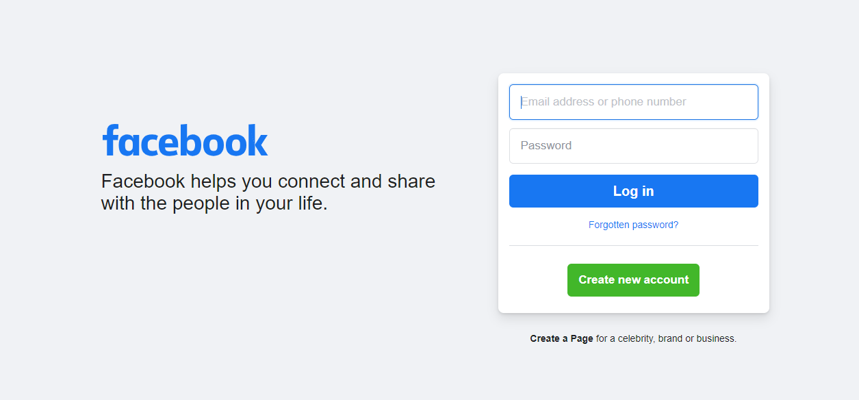
To understand the selection of secondary colors, check the Facebook login page, as its designer selects blue as the main color and gray and white as accents to add interest and balance the design.
➢ Add Accents Color
Accent colors highlight different elements in the design, like buttons and links. So while picking the accent color for your login page design ideas, ensure it should contrast with the rest of the palette. So it can be consumed to bring users’ attention to major components on the login page.
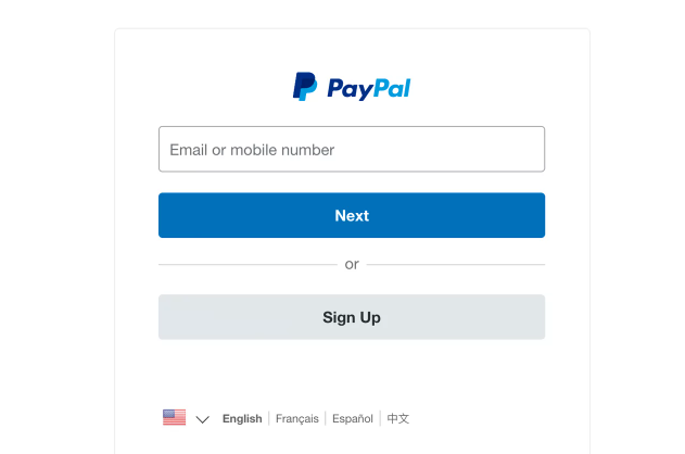
The PayPal login page is the most effective example of using accent color in the login design page color pallet. The design of the login page consists of a blue and white color palette with bright blue color for the login or sign-up button. This gives users a clear and contrasting call to action and draws attention toward the login option.

➢ Test The Palette
The color palette is ready; now it’s time to test it. That can be possible by using a mockup login page design. It will guarantee that your chosen color palette is compatible with your brand and effectively appeal to your target audience. Also, it helps you to identify potential problems, like accessibility concerns or usability issues, that can be adjusted in the testing process.
Best Practices for Login Page Design
Along with the right color palette, other practices must be followed to design a user-friendly and effective functioning Login Page. That is:
➢ Strive For Simplicity
A cluttered login page design can confuse the mind of users, so it’s necessary to design a login page that is easy to use with clear labeling and intuitive navigation.
➢ Prioritize Security
Login page design must prioritize security features, including password strength meters, CAPTCHAs, and two-factor authentication. The login page is often the first line against unauthorized access to sensitive information.
➢ Consistency With Branding
The design of your website’s login page must be consistent with the overall branding of your website, as it establishes a recognizable brand identity that lets users feel associated.
➢ Mobile Friendly Design
When your website login page is accessed by the masses on various devices, it’s necessary to design and optimize it for mobile screens, allowing it to adjust as per the screen size.
Conclusion
Overall, color is significant in login page design which sets the tone and mood of the page, affecting user experience, perception, and behavior. So, choosing the right color palette becomes mandatory while working on login page design ideas. Using the right choice of color not only results in a visually pleasing interface but also provides unmatchable functionality.
Along with a color palette, you can also use tools like login designer that support your business to establish stronger bonds with customers and improve overall user experience.